Table of Contents
- Why Most Sales Dashboards Fail (And What to Do About It)
- Essential Sales Dashboard KPIs in 2026
- 3 Sales Dashboard Templates for Local Prospecting Campaigns
- Sales Dashboard Examples From Real Companies
- How to Build Your Sales Dashboard (Step-by-Step)
- FAQ — Sales Dashboards
89% of revenue organizations have now adopted AI in their sales stack. Up from 34% in 2023. That's a massive shift. And yet? Most sales teams are still staring at dashboards built for a completely different era. Dashboards packed with vanity metrics that look impressive in screenshots but don't actually help anyone close a deal.
I call it dashboard fatigue. You've probably seen it. Someone spends two weeks building this beautiful sales dashboard with seventeen charts, four color-coded tables, and a fancy logo in the corner. Looks great. Problem is nobody uses it after week one.
Steve Harlow, CSO at Sopro, put it perfectly: "Dashboard reports must drive action. If a metric doesn't inform a decision or behaviour, it's just noise." And he's right. Most sales dashboards are basically expensive noise machines.
Why Most Sales Dashboards Fail (And What to Do About It)
Here's what goes wrong. Teams try to show everything at once. Revenue numbers next to email open rates next to pipeline stages next to individual rep performance. It's like putting every ingredient in your fridge into one smoothie. Technically possible. Definitely not a good idea.
The other big mistake? Not tailoring the dashboard to who's actually looking at it. A sales rep checking their numbers on Monday morning needs completely different data than a VP reviewing quarterly trends. Same dashboard serving both? That's a dashboard serving neither.
And then there's the data problem. You build this perfect sales performance dashboard, connect it to your CRM, and... half the fields are empty because reps aren't logging their activities. Or the data's three weeks old because nobody set up the sync properly.
The fix isn't more data. It's the right data, structured for your specific sales motion. Let me show you exactly what that looks like.
Essential Sales Dashboard KPIs in 2026
Alright so what should actually be on your sales dashboard? Not everything. Just the metrics that change decisions. Here are the KPIs that matter right now.
Lead Response Time — Under 5 minutes. That's the benchmark. If your team takes longer than that to respond to an inbound lead, you're basically handing money to competitors. This one metric alone can transform your conversion rates.
MQL to SQL Conversion Rate — According to Martal Group's 2026 data, the benchmark sits at 10%. If you're way below that, your qualification criteria might be off. Or your leads just aren't that great. Either way, your dashboard should make this painfully obvious.
Pipeline Coverage Ratio — Salesforce recommends a minimum of 3:1. Meaning you need three dollars in pipeline for every dollar of quota. Anything less and you're flying blind hoping deals close. Spoiler: hope is not a strategy.
Win Rate — Here's an interesting one. Highspot's 2025 research found that proactive sellers achieve 33-41% win rates compared to just 18-25% for reactive sellers. Those same proactive sellers generate 19-30% higher annual revenue. So your dashboard shouldn't just track win rate — it should track how deals were sourced.
Median B2B Conversion Rate — GrowthToday's 2026 data puts this at 2.9%. Sounds low right? But that's the reality. Knowing this number helps you set realistic expectations instead of chasing fantasy targets.
Sales Cycle Length — Don't obsess over the absolute number here. Track the trend. Is it getting longer? Shorter? What changed? That's where the insight lives.
Forecast Accuracy — With AI tools improving fast, target 85% or higher. If your forecasts are consistently off by more than 15%, something fundamental is broken in your pipeline data.
One thing worth noting: 80% of buyer interactions now happen through digital channels. And the average B2B buying committee involves 13 decision-makers per deal. Your sales dashboard needs to account for this complexity. Pipeline velocity matters more than ever when you've got thirteen people who need to say yes.
For teams running local outreach campaigns, tracking local prospecting KPIs alongside these standard metrics gives you a much clearer picture of what's actually working in specific markets.
Platforms like Scrap.io let you build a fresh lead pipeline from Google Maps data — with a free 7-day trial including 100 leads to test your sales dashboard setup.
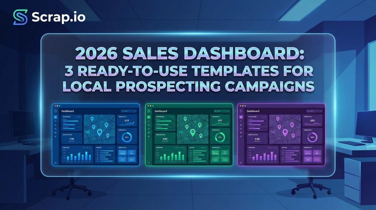
3 Sales Dashboard Templates for Local Prospecting Campaigns
Here's where things get different from every other dashboard guide you've read. Most sales dashboard templates are designed for generic SaaS pipelines. But if you're running geographic prospecting — targeting local businesses by city, category, or region — you need something built for that specific motion.
I put together three templates that actually work for local campaigns. Pick the one that matches your role.
Template #1 — Pipeline Dashboard for Google Maps Leads
Who it's for: Sales reps managing geographic outbound campaigns.
This is your daily driver. The sales pipeline dashboard that shows exactly where every lead stands and flags anything that's stuck.
Columns to track:
Lead source — Google Maps category, city, state. You need to know where leads came from so you can double down on what works.
Contact info status — email found, phone only, website only. This tells you which outreach channel to use before you even start.
Outreach status — not contacted, email sent, replied, meeting booked. Simple but critical.
Deal stage — lead, qualified, proposal, closed. The standard progression but tracked per geography.
Lead quality score — based on Google rating, review count, website presence. A business with 4.8 stars and 200 reviews is a different conversation than one with 2.1 stars and three reviews.
Days in stage — this is the one most people forget. Flag anything sitting in the same stage for more than 7 days in yellow. More than 14 days? Red. Stagnation kills pipelines.
Think Kanban-style layout with color coding. Green means moving. Yellow means it's been stuck 7+ days. Red means something's gone wrong.
Quick note: if you're building a sales pipeline from Google Maps, tools like Scrap.io export pre-structured columns — email, phone, Google rating, review count, website — that plug directly into this template. Saves you the setup headache.
Template #2 — KPI Performance Dashboard for Managers
Who it's for: Sales managers overseeing 3-10 reps on local campaigns.
Different job, different dashboard. As a manager you don't need to see individual lead details. You need the big picture.
KPIs to display:
Leads contacted per rep — daily and weekly. Who's putting in the work and who isn't? This number doesn't lie.
Response rate by lead source and geography — maybe leads in Austin respond twice as well as leads in Denver. Your dashboard should surface that immediately.
Conversion rate by stage — MQL to SQL to Closed. Track this per rep and per territory.
Revenue per territory and per category — restaurants in Miami vs contractors in Dallas. Where's the money actually coming from?
Top-performing cities and business categories — double down on winners.
Pipeline value vs quota — the coverage ratio we talked about. Is each rep carrying enough pipeline?
Scorecard layout works best here. Traffic-light indicators per rep plus a geographic heat map showing conversion by state or city. If you're working on defining your ideal customer profile by geography, this dashboard will basically tell you which ICPs to prioritize.
Template #3 — Activity Dashboard for Outbound Teams
Who it's for: SDR teams running cold outreach to local businesses.
This one's all about volume and velocity. SDRs live and die by activity metrics.
Metrics to track:
Emails sent, opened, replied — daily numbers. Non-negotiable.
Calls made, connected, meetings booked — the classic SDR trifecta.
LinkedIn touches sent and accepted — for teams using social selling alongside email.
Follow-up compliance rate — what percentage of leads got 3 or more touchpoints? Most deals don't happen on the first touch. This metric keeps reps honest. If you need a framework for nurturing Google Maps leads through multiple touchpoints, having this number front and center makes all the difference.
Best time-of-day and day-of-week for engagement — patterns emerge fast when you track this. Maybe Wednesday mornings crush it for your market. Your dashboard should reveal that.
Bounce rate by lead source — if a certain source produces 30% bounce rates, stop using it. Fresh data matters. A lot.
Bar charts for daily activity, trend lines for weekly performance, and a leaderboard widget to keep things competitive. That's the layout. You can automate your CRM with Google Maps data to feed this dashboard automatically instead of relying on manual data entry.
Sales Dashboard Examples From Real Companies
Okay theory is great. But what are actual companies doing? Let me show you some real sales dashboard examples.
Salesforce offers 7 built-in dashboard templates covering pipeline, performance, activity, leaderboard, and risk views. The key takeaway? They use role-based views. Reps see individual metrics. Managers see team rollups. Executives see strategic trends. Same data, different lens. Smart.
Tableau takes a different approach with self-service BI dashboards. Their quarterly forecast, account management, pipeline, and year-over-year growth dashboards work as a single source of truth. When everyone pulls from the same dataset, you eliminate those painful "my numbers don't match your numbers" conversations.
Geckoboard published 13 dashboard examples based on real companies. What caught my attention was their Aircall integration for call monitoring. The takeaway here is connecting dashboards to actual tools — phone systems, CRM, email platforms — makes data real-time instead of retroactive.
HubSpot has a free Sales Metrics Calculator in Excel format with role-specific layouts: daily users, weekly reviewers, and meeting presentations. Their insight is that where you VIEW the dashboard matters as much as what's on it. Desktop for daily work. Mobile for quick checks. TV screen for team visibility.
Coefficient offers a Prospect Tracking Template for Google Sheets with live CRM sync. And honestly for teams under 20 people, you don't need expensive BI tools. Google Sheets with the right structure gets the job done.
But here's the thing none of these templates address. None of them are built for local prospecting campaigns. None of them have columns for geographic data, Google Maps categories, or lead quality based on review scores. That's a massive gap if you're running outbound to local businesses.
Want to test these templates with real leads? Start with 100 free local business contacts from Scrap.io's Google Maps database. When you're comparing lead generation platforms, the ability to get structured data that plugs directly into your dashboard is a serious advantage.
How to Build Your Sales Dashboard (Step-by-Step)
So how to build a sales dashboard that actually drives results? Five steps. Not complicated but most people skip at least two of them.
Step 1: Define your sales motion. Are you running outbound to local businesses? Inbound? Account-based? Your dashboard structure follows your motion. An SDR team cold-emailing restaurants in Texas needs a completely different setup than an AE team managing enterprise accounts. Start here or everything else falls apart.
Step 2: Pick 5-7 KPIs. Reference the KPIs section above. Rule of thumb: if a metric doesn't change a decision, remove it. I've seen dashboards with 25+ metrics. Nobody looks at them. Five to seven core numbers. That's it.
Step 3: Choose your tool. Excel or Google Sheets for small teams. A free sales dashboard template in Excel is honestly fine for teams under 10. Tableau or Power BI for data-heavy organizations. Built-in CRM dashboards for mid-market teams already living in their CRM. Use what you'll actually check daily.
Step 4: Feed it with fresh data. A dashboard is only as good as its data source. This is where most setups fail. Stale data produces stale insights. For local prospecting, tools like Scrap.io pull live business data from Google Maps — email, phone, rating, category — that auto-populates your pipeline columns. You can also automate lead generation with Make.com to keep data flowing without manual work. Companies using data-driven dashboards make decisions 5x faster according to AgencyAnalytics. Fresh data is the difference between a dashboard that drives revenue and one that collects dust.
Step 5: Set your review cadence. Daily for activity dashboards. Weekly for pipeline reviews. Monthly for performance trends. Stick to the schedule. A full marketing automation setup can trigger alerts when KPIs hit thresholds so you're not waiting for the weekly meeting to spot problems.
One last thing. 76% of local searchers visit a business within 24 hours according to Google research. If you're tracking local prospecting campaigns, speed matters. Your dashboard should highlight leads that need immediate follow-up, not bury them in a spreadsheet somewhere.
FAQ — Sales Dashboards
What should be on a sales dashboard?
A sales dashboard should display 5-7 core KPIs tied to revenue: pipeline value, win rate, lead response time, conversion rate by stage, sales cycle length, and forecast accuracy. Tailor metrics to the viewer — reps need activity data, managers need team performance, executives need strategic trends.
What are the 5 types of sales dashboards?
The five main types are: pipeline dashboards tracking deal progression, activity dashboards monitoring calls and emails, performance dashboards measuring quota attainment, leaderboard dashboards ranking rep performance, and forecast dashboards projecting revenue. Most teams benefit from combining two or three types.
How do I track leads from Google Maps in a dashboard?
Export business data — email, phone, rating, category, location — from Google Maps using a tool like Scrap.io. Import into your CRM or spreadsheet. Build pipeline columns matching your outreach stages. Track conversion by geography, business category, and lead quality score for actionable insights.
What's the best free sales dashboard template?
For small teams, HubSpot's free Sales Metrics Calculator (Excel) and Coefficient's Prospect Tracking Template (Google Sheets) are strong starting points. Both offer pre-built KPI structures. For local prospecting, pair them with a Google Maps data source for up-to-date lead information.
The sales dashboard market has changed. Generic templates showing revenue closed and deals in pipeline aren't enough anymore. Not when 80% of buyer interactions happen digitally and buying committees average 13 decision-makers per deal.
What separates teams that hit quota from those that don't? Actionable data. Dashboards that drive decisions, not just display numbers. And for anyone running local prospecting campaigns, that means templates built specifically for geographic outreach — not repurposed enterprise setups.
Start small. Pick one template from above. Load it with actual leads. Track for two weeks. Then adjust. The best sales dashboard is the one your team actually uses every single day.
Try Scrap.io free for 7 days — get 100 verified local business leads instantly and plug them into your sales dashboard today.
Ready to generate leads from Google Maps?
Try Scrap.io for free for 7 days.